Interaction Design : Client Confidential Summer 2010
Challenge:Create an interface that would enable this clients' users to easily add services to an existing, web-based account.
Approach:Given that I'd be designing a solution that needed to interface with existing customer and product databases and systems, I first needed to understand the model the client used to present its products and services. I developed a few static prototypes early on, just to test language and basic flow, only to find that the mental model most users had regarding services was significantly different from that of the client's.
Using those insights, I proceeded to revise and update my prototype, building it out in code to add functional elements. Using HTML, CSS and JavaScript, I was able to execute the specific interactions I wanted, while also including the necessary business logic to hide or show options based on prior selections. Doing so made the prototype respond to actual user choices, greatly enhancing the amount and quality of feedback we received in subsequent usability tests. Finally, annotations inserted for the client, when toggled on, change to match each of the varying page states as the user clicks on elements in the prototype.
Project Highlights:- Using jQuery extensively, across a 20-page, multi-state prototype for high-fidelity interactions.
- Developing a system for integrating annotations in a manner that's both unobtrusive and comprehensive.
- Creating something that helped the client envision the end product months before it would be ready to launch on their site.
Client has been fictionalized, but services and choices are similar in nature, and interactions are the same.
Or view a video demo showing a page walk-through, below:
Application Design : WhitePages Spring 2010
Challenge: Expand upon existing static wireframes and design comps for a new, web-based contact-management tool. Add support for new features and functionality, and demonstrate specific interaction designs and application states.
Approach: I stepped into the UX lead role on this project while it was still in the early stages, with core product features for both the web app and native iPhone app still being defined. As we created user stories for each iteration based on priorities given to us by the product manager, I'd determine how best to approach the feature, from the conceptual (task flow maps) to the more concrete (page wireframes).
The core user view and edit pages for the web app had been wireframed and designed in an earlier iteration, before I joined the team, but changes were now required to meet new information display needs. Starting with that existing page design, I turned the flat comp into HTML and CSS. Then I revised the content, structure and design, both to meet the new business requirements and to incorporate feedback we had gotten from users from an early round of usability testing. Next, I added in some simple add/remove functionality and design interactions with jQuery and a little CSS3. For other features, I wireframed the UI in OmniGraffle and handed off those wireframes to a developer for implementation.
View the contact page prototype (Firefox, Safari or Chrome recommended).
Project Highlights:- Conducting original user research, including one-on-one, on-site interviews with users, that was an invaluable input into multiple design activities.
- Experimenting with new tools and techniques for both creating artifacts (application mapping) and the application interface (drag and drop to merge contacts).
- Working with the back-end developers to help solve hairy problems involving merging contact data, and balancing user control with ease-of-use in the UI


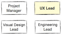
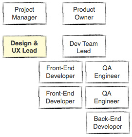
Core Project Team:
Visual & Interaction Design : WhitePages Summer 2009
Challenge: Apply the new corporate look and feel and add new functionality to a section of the site essential to attracting search engine traffic.
Approach: Acting as the combined visual design and user experience lead in an Agile project team, I first applied new styling to existing section content via CSS changes in Firebug. Then I created a number of new design patterns and elements, both as master Photoshop files to be shared with other teams' designers, and as coded components that were then integrated and/or re-coded by the front-end developers.
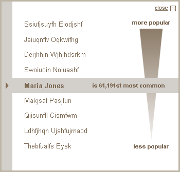
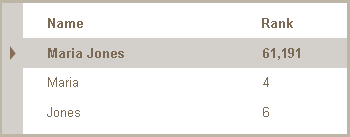
The slider UI for filtering names by popularity within a given letter, and the widget for viewing other names adjacent in popularity were two completely new controls that I designed, prototyped and specified.
Project Highlights:- Working with the first of many close-knit Agile teams at WhitePages, with developers who were eager to participate in the design process.
- Creating entirely new design elements that were then picked up as standard patterns by the main site as a whole.
- Finding a way to present masses of often complex data in a standardized manner that was appealing to both our robot and human visitors.


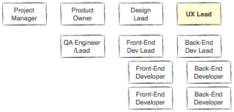
 Core Project Team:
UX Research : Windows Mobile Winter/Spring 2007
Challenge: Using existing user research provided by Microsoft, assess user experience on two U.S. mobile carrier web sites (AT&T Wireless, Verizon Wireless) for shoppers interested in purchasing a smartphone.
Approach: Working closely with the lead Strategist and Account Director for the Windows Mobile account at our agency (VML/Wunderman), I absorbed the existing user research about circa 2007 smartphone users to conduct and map cognitive walk-throughs of the Verizon Wireless and AT& Wireless (Cingular) web sites. In parallel, I developed common user scenarios at different stages of the customer lifecycle, and across different customer types, to identify the site paths that would be of most value to Microsoft.
Project Highlights:- Developing new and effective techniques for gathering and presenting data to the client, which enabled them to quickly hone in specific opportunities worth pursuing with the mobile carriers.
- Being able to validate assumptions about prominence and placement of information about BlackBerry versus Windows Mobile through concrete, data-driven visualizations.
- Giving the client a more effective, user-centric way of helping them advocate for more and better information about Windows Mobile on the carrier sites.


Core Project Team:
Interaction Design & Information Architecture : Coinstar Fall 2004
Challenge: Overhaul the entire Coinstar kiosk UI and workflow to support two major initiatives: create an interface that would allow for touchscreen navigation on select new machines, and add the ability to convert coins to one of a selection of various gift cards.
Approach: My first goal was to understand all the possible paths a kiosk user could currently take. My team conducted a usability study, where I was able to observe user interviews and behavior using an actual machine. I used those insights, plus market research data, to create additional scenarios I then acted out, spending hours in our test lab pouring buckets full of coins into real machines.
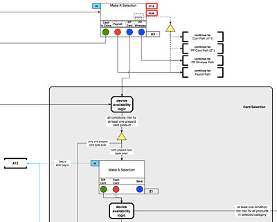
For each path, I sketched out quick workflows, noting key screens and snapping photos of the UI. I then created the new master workflow diagram, consolidating existing and adding new elements to pull together all of the paths, conditional elements, potential errors and timeouts into a coherent whole. Through many revisions, I worked closely with the engineering team to validate functionality and scenarios.
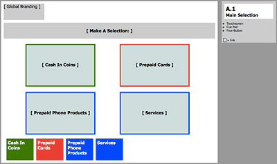
Then I began wireframing individual screens, moving quickly to stitch them together into an interactive prototype using HTML, CSS and JavaScript that walked through the primary flow in a variety of modes: four-button ("classic"), touchscreen, numeric keypad ("accessibility"), U.S., Canada and UK.
Project Highlights:- Conducting many hours of primary user research, data from which helped fuel and validate design choices.
- Developing a workflow diagram so detailed and comprehensive, it was used as a reference document by multiple other departments (Marketing, New Business) whenever there was a "How does it work?"-style question that needed to be answered.
- Addressing some major user experience challenges that ventured far beyond the digital -- e.g. What do we do if the gift cards get jammed in the hopper holding them?
 Interactive Prototype:
Core Project Team: